> ## Documentation Index
> Fetch the complete documentation index at: https://docs.li.fi/llms.txt
> Use this file to discover all available pages before exploring further.
# Customize Widget
> Customize the look and feel of the widget to match the design of your dApp and suit your needs
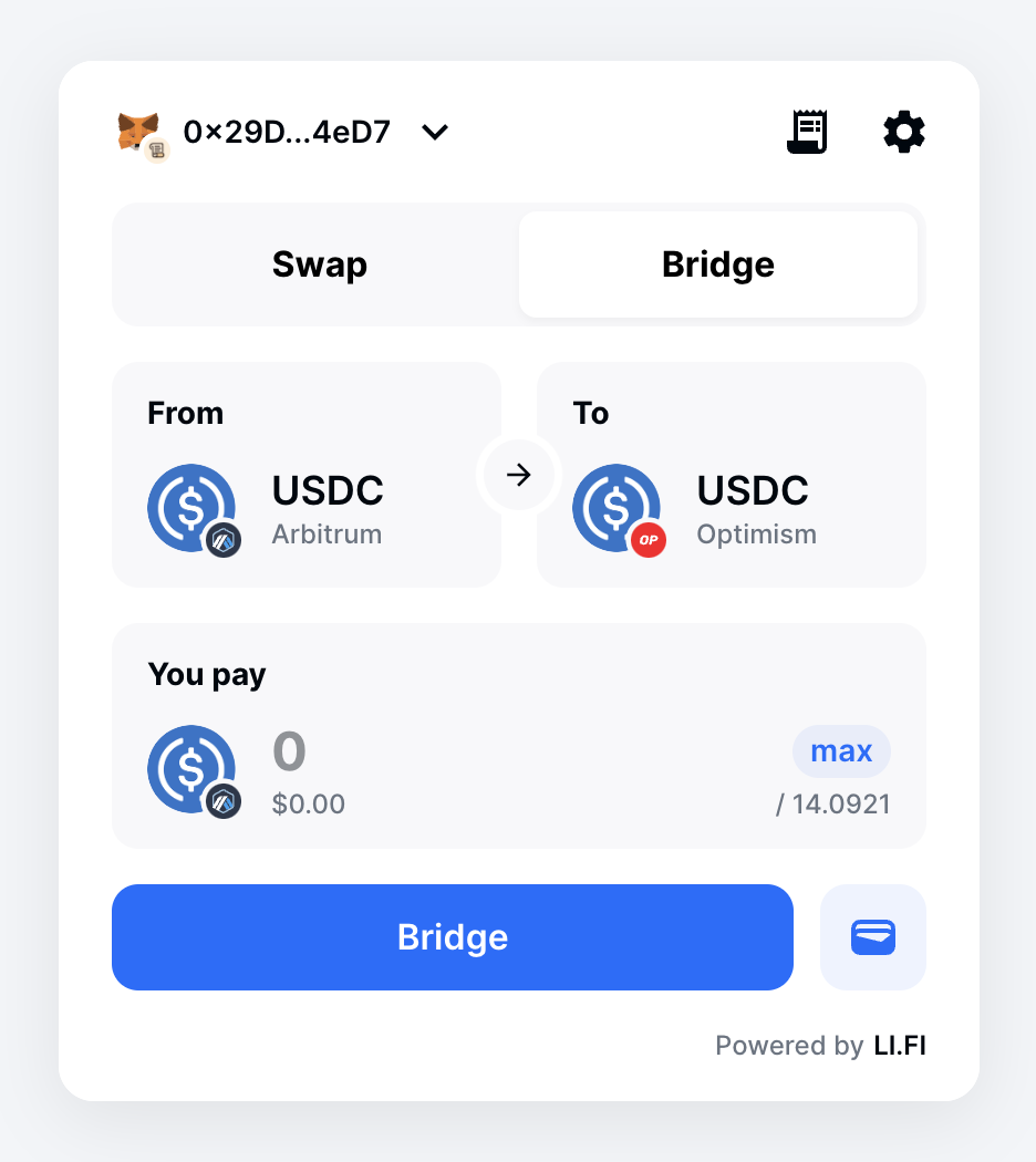
**LI.FI Widget** supports visual customization, allowing you to match your web app's design. The widget's layout stays consistent, but you can modify colors, fonts, border radius, container styles, disable or hide parts of the UI, and more.
Start customizing the widget by tweaking some of the following options:
```typescript theme={"system"}
interface WidgetConfig {
// sets default appearance - light, dark, or system
appearance?: Appearance;
// disables parts of the UI
disabledUI?: DisabledUIConfig;
// hides parts of the UI
hiddenUI?: HiddenUIConfig;
// makes parts of the UI required
requiredUI?: RequiredUIConfig;
// sets default UI behaviors
defaultUI?: DefaultUI;
// tweaks container, components, colors, fonts, border-radius
theme?: WidgetTheme;
}
```
## Theme
By customizing the theme, you can ensure the LI.FI Widget matches the look and feel of your application, providing a seamless user experience.
Preview theme changes live in the [Widget Playground](https://playground.li.fi/) — open **Theme** in the sidebar and click **Edit theme**.
The `theme` configuration option allows you to customize various aspects of the widget's appearance, including colors, typography, shapes, and component styles.
### Containers
The `container` option customizes the main container of the widget.
The `routesContainer` and `chainSidebarContainer` options apply custom styles to routes and chain sidebar expansions respectively (available in `wide` variant).
In the example below, we adjust the boxShadow and border-radius properties of all the containers.
```typescript theme={"system"}
import { LiFiWidget, WidgetConfig } from '@lifi/widget';
import { useMemo } from 'react';
export const WidgetPage = () => {
const widgetConfig: WidgetConfig = useMemo(
() => ({
theme: {
container: {
boxShadow: '0px 8px 32px rgba(0, 0, 0, 0.08)',
borderRadius: '16px',
},
chainSidebarContainer: {
boxShadow: '0px 8px 32px rgba(0, 0, 0, 0.08)',
borderRadius: '16px',
},
routesContainer: {
boxShadow: '0px 8px 32px rgba(0, 0, 0, 0.08)',
borderRadius: '16px',
},
},
}),
[]
);
return ;
};
```
### Color Schemes
The `colorSchemes` option defines separate color palettes for light and dark modes. This allows you to customize colors independently for each appearance mode.
```typescript theme={"system"}
import { LiFiWidget, WidgetConfig } from '@lifi/widget';
import { useMemo } from 'react';
export const WidgetPage = () => {
const widgetConfig: WidgetConfig = useMemo(
() => ({
theme: {
colorSchemes: {
light: {
palette: {
primary: { main: '#7B3FE4' },
secondary: { main: '#F5B5FF' },
background: {
default: '#ffffff',
paper: '#f8f8fa',
},
text: {
primary: '#000000',
secondary: '#747474',
},
},
},
dark: {
palette: {
primary: { main: '#9B6FE4' },
secondary: { main: '#D59FFF' },
background: {
default: '#121212',
paper: '#212121',
},
text: {
primary: '#ffffff',
secondary: '#bbbbbb',
},
},
},
},
},
}),
[]
);
return ;
};
```
### Shape and Typography
The `shape` option defines border-radius overrides for all elements in the widget:
* `borderRadius` - Primary border radius for cards and containers
* `borderRadiusSecondary` - Secondary border radius for buttons and inputs
* `borderRadiusTertiary` - Tertiary border radius for specific elements
The `typography` option customizes the font settings like font families.
```typescript theme={"system"}
import { LiFiWidget, WidgetConfig } from '@lifi/widget';
import { useMemo } from 'react';
export const WidgetPage = () => {
const widgetConfig: WidgetConfig = useMemo(
() => ({
theme: {
colorSchemes: {
light: {
palette: {
primary: { main: '#7B3FE4' },
secondary: { main: '#F5B5FF' },
},
},
},
shape: {
borderRadius: 12,
borderRadiusSecondary: 12,
borderRadiusTertiary: 24,
},
typography: {
fontFamily: 'Inter, sans-serif',
},
container: {
boxShadow: '0px 8px 32px rgba(0, 0, 0, 0.08)',
borderRadius: '16px',
},
},
}),
[]
);
return ;
};
```
### Components
The `components` option allows you to customize the styles of specific components within the widget.
The current list of available components:
* **MuiAppBar** - Used as a header/navigation component at the top of the widget.
* **MuiAvatar** - Used to display token/chain avatars.
* **MuiButton** - Used for various buttons in the widget.
* **MuiCard** - Used for card elements within the widget. There are three default card variants:
* **outlined** - Default variant where the card has thin borders.
* **elevation** - Variant where the card has a shadow.
* **filled** - Variant where the card is filled with color (`palette.background.paper` property).
* **MuiDrawer** - Used for the drawer container when `variant` is set to `'drawer'`.
* **MuiIconButton** - Used for icon buttons within the widget.
* **MuiInputCard** - Used for input cards within the widget.
* **MuiNavigationTabs** - Used for navigation tabs in the split mode.
* **MuiNavigationTab** - Used for individual navigation tab items.
* **MuiTabs** - Used for tab navigation within the widget (available in `split` mode).
* **MuiCheckbox** - Used for checkbox elements within the widget.
With the `components` option, each component can be customized using the MUI's `styleOverrides` property, allowing for granular control over its styling.
```typescript theme={"system"}
import { LiFiWidget, WidgetConfig } from '@lifi/widget';
import { tabsClasses } from '@mui/material';
import { useMemo } from 'react';
export const WidgetPage = () => {
const widgetConfig: WidgetConfig = useMemo(
() => ({
theme: {
colorSchemes: {
light: {
palette: {
primary: { main: '#006Eff' },
secondary: { main: '#FFC800' },
background: {
default: '#ffffff',
paper: '#f8f8fa',
},
text: {
primary: '#00070F',
secondary: '#6A7481',
},
grey: {
200: '#EEEFF2',
300: '#D5DAE1',
700: '#555B62',
800: '#373F48',
},
},
},
},
shape: {
borderRadius: 12,
borderRadiusSecondary: 12,
borderRadiusTertiary: 24,
},
container: {
boxShadow: '0px 8px 32px rgba(0, 0, 0, 0.08)',
borderRadius: '16px',
},
components: {
MuiCard: {
defaultProps: { variant: 'filled' },
},
// Used only for 'split' mode and can be safely removed if not used
MuiNavigationTabs: {
styleOverrides: {
root: {
backgroundColor: '#f8f8fa',
[`.${tabsClasses.indicator}`]: {
backgroundColor: '#ffffff',
},
},
},
},
},
},
}),
[]
);
return ;
};
```
 ## Pre-configured Themes
The LI.FI Widget includes several pre-configured themes that provide a starting point for customization. These themes demonstrate various configurations of colors, shapes, and component styles, giving you an idea of how the widget can be styled to fit different design requirements.
Besides the default theme, there are pre-configured themes available:
```typescript theme={"system"}
import {
azureLightTheme,
jumperTheme,
watermelonLightTheme,
windows95Theme
} from '@lifi/widget';
```
### Azure Light
A clean, professional theme with blue primary colors.
### Watermelon Light
A playful theme with pink/coral primary colors.
### Windows 95
A retro theme mimicking the classic Windows 95 aesthetic with sharp corners and distinctive shadows.
### Customizing Pre-configured Themes
You can further customize these pre-configured themes by spreading them and overriding specific properties:
```typescript theme={"system"}
import { LiFiWidget, WidgetConfig, azureLightTheme } from '@lifi/widget';
const widgetConfig: WidgetConfig = {
theme: {
...azureLightTheme,
container: {
...azureLightTheme.container,
borderRadius: '24px',
},
},
};
```
## Appearance
The widget has complete dark mode support out of the box. The `appearance` option can be set to:
* `'light'` - Always use light mode
* `'dark'` - Always use dark mode
* `'system'` - Match the user's system settings (default)
```typescript theme={"system"}
import { LiFiWidget, WidgetConfig } from '@lifi/widget';
import { useMemo } from 'react';
export const WidgetPage = () => {
const widgetConfig: WidgetConfig = useMemo(
() => ({
appearance: 'dark',
}),
[]
);
return ;
};
```
## Disabled UI Elements
The `disabledUI` property allows you to specify which UI elements should be disabled in the widget. Disabling UI elements can be useful to prevent user interaction with certain parts of the widget that might not be necessary or desirable for your specific implementation.
```typescript theme={"system"}
interface DisabledUIConfig {
// Disables the input field for the token amount
fromAmount?: boolean;
// Disables the button for the source token selection
fromToken?: boolean;
// Disables the button for specifying the destination address
toAddress?: boolean;
// Disables the button for the destination token selection
toToken?: boolean;
}
```
## Hidden UI Elements
The `hiddenUI` property allows you to specify which UI elements should be hidden in the widget. This is useful for tailoring the user interface to fit your specific needs by removing elements that might not be relevant for your use case.
```typescript theme={"system"}
interface HiddenUIConfig {
// Hides the connected wallets section in address book
addressBookConnectedWallets?: boolean;
// Hides the "All Networks" option in chain selectors
allNetworks?: boolean;
// Hides the appearance settings UI (light/dark mode switch)
appearance?: boolean;
// Hides the bridges settings UI
bridgesSettings?: boolean;
// Hides the chain selection UI
chainSelect?: boolean;
// Hides the chain sidebar in the wide variant
chainSidebar?: boolean;
// Hides the contact support button
contactSupport?: boolean;
// Hides the close button in the drawer variant
drawerCloseButton?: boolean;
// Hides the button for the source token selection
fromToken?: boolean;
// Hides the gas refuel message UI
gasRefuelMessage?: boolean;
// Hides the toggle to hide tokens with small balances
hideSmallBalances?: boolean;
// Hides the transaction history UI
history?: boolean;
// Hides the insufficient gas message UI
insufficientGasMessage?: boolean;
// Hides the integrator-specific step details UI
integratorStepDetails?: boolean;
// Hides the language selection UI
language?: boolean;
// Hides the low address activity confirmation dialog
lowAddressActivityConfirmation?: boolean;
// Hides the 'Powered by LI.FI' branding - not recommended :)
poweredBy?: boolean;
// Hides the button to reverse/swap the from and to tokens
reverseTokensButton?: boolean;
// Hides the price impact indicator on route cards
routeCardPriceImpact?: boolean;
// Hides the token description in routes
routeTokenDescription?: boolean;
// Hides the search bar in the tokens list
searchTokenInput?: boolean;
// Hides the button for specifying the destination address
toAddress?: boolean;
// Hides the button for the destination token selection
toToken?: boolean;
// Hides the wallet menu UI
walletMenu?: boolean;
}
```
The following example shows how to hide appearance and language settings in the UI:
```typescript theme={"system"}
import { LiFiWidget, WidgetConfig } from '@lifi/widget';
import { useMemo } from 'react';
export const WidgetPage = () => {
const widgetConfig: WidgetConfig = useMemo(
() => ({
hiddenUI: { language: true, appearance: true },
}),
[]
);
return ;
};
```
## Required UI Elements
The `requiredUI` property allows you to specify which UI elements should be required in the widget. This means that the user must interact with these elements for the widget to proceed with swapping/bridging.
```typescript theme={"system"}
interface RequiredUIConfig {
// Shows a message when the account is a smart account that may have
// different addresses on other chains
accountDeployedMessage?: boolean;
// Makes the destination address required for interaction
toAddress?: boolean;
}
```
### Required destination address
Making the destination address required can come in handy when developers want to build a flow where only a pre-configured list of wallet addresses can be set as the destination. See [Configure a curated list of wallet addresses](/widget/configure-widget#configure-a-curated-list-of-wallet-addresses) for more details.
If you are interested in additional customization options for your service, reach out via our [Partnership](https://docs.li.fi/overview/partnership) page.
As you can see, widget customization is pretty straightforward. We are eager to see what combinations you will come up with as we continue to add new customization options.
## Pre-configured Themes
The LI.FI Widget includes several pre-configured themes that provide a starting point for customization. These themes demonstrate various configurations of colors, shapes, and component styles, giving you an idea of how the widget can be styled to fit different design requirements.
Besides the default theme, there are pre-configured themes available:
```typescript theme={"system"}
import {
azureLightTheme,
jumperTheme,
watermelonLightTheme,
windows95Theme
} from '@lifi/widget';
```
### Azure Light
A clean, professional theme with blue primary colors.
### Watermelon Light
A playful theme with pink/coral primary colors.
### Windows 95
A retro theme mimicking the classic Windows 95 aesthetic with sharp corners and distinctive shadows.
### Customizing Pre-configured Themes
You can further customize these pre-configured themes by spreading them and overriding specific properties:
```typescript theme={"system"}
import { LiFiWidget, WidgetConfig, azureLightTheme } from '@lifi/widget';
const widgetConfig: WidgetConfig = {
theme: {
...azureLightTheme,
container: {
...azureLightTheme.container,
borderRadius: '24px',
},
},
};
```
## Appearance
The widget has complete dark mode support out of the box. The `appearance` option can be set to:
* `'light'` - Always use light mode
* `'dark'` - Always use dark mode
* `'system'` - Match the user's system settings (default)
```typescript theme={"system"}
import { LiFiWidget, WidgetConfig } from '@lifi/widget';
import { useMemo } from 'react';
export const WidgetPage = () => {
const widgetConfig: WidgetConfig = useMemo(
() => ({
appearance: 'dark',
}),
[]
);
return ;
};
```
## Disabled UI Elements
The `disabledUI` property allows you to specify which UI elements should be disabled in the widget. Disabling UI elements can be useful to prevent user interaction with certain parts of the widget that might not be necessary or desirable for your specific implementation.
```typescript theme={"system"}
interface DisabledUIConfig {
// Disables the input field for the token amount
fromAmount?: boolean;
// Disables the button for the source token selection
fromToken?: boolean;
// Disables the button for specifying the destination address
toAddress?: boolean;
// Disables the button for the destination token selection
toToken?: boolean;
}
```
## Hidden UI Elements
The `hiddenUI` property allows you to specify which UI elements should be hidden in the widget. This is useful for tailoring the user interface to fit your specific needs by removing elements that might not be relevant for your use case.
```typescript theme={"system"}
interface HiddenUIConfig {
// Hides the connected wallets section in address book
addressBookConnectedWallets?: boolean;
// Hides the "All Networks" option in chain selectors
allNetworks?: boolean;
// Hides the appearance settings UI (light/dark mode switch)
appearance?: boolean;
// Hides the bridges settings UI
bridgesSettings?: boolean;
// Hides the chain selection UI
chainSelect?: boolean;
// Hides the chain sidebar in the wide variant
chainSidebar?: boolean;
// Hides the contact support button
contactSupport?: boolean;
// Hides the close button in the drawer variant
drawerCloseButton?: boolean;
// Hides the button for the source token selection
fromToken?: boolean;
// Hides the gas refuel message UI
gasRefuelMessage?: boolean;
// Hides the toggle to hide tokens with small balances
hideSmallBalances?: boolean;
// Hides the transaction history UI
history?: boolean;
// Hides the insufficient gas message UI
insufficientGasMessage?: boolean;
// Hides the integrator-specific step details UI
integratorStepDetails?: boolean;
// Hides the language selection UI
language?: boolean;
// Hides the low address activity confirmation dialog
lowAddressActivityConfirmation?: boolean;
// Hides the 'Powered by LI.FI' branding - not recommended :)
poweredBy?: boolean;
// Hides the button to reverse/swap the from and to tokens
reverseTokensButton?: boolean;
// Hides the price impact indicator on route cards
routeCardPriceImpact?: boolean;
// Hides the token description in routes
routeTokenDescription?: boolean;
// Hides the search bar in the tokens list
searchTokenInput?: boolean;
// Hides the button for specifying the destination address
toAddress?: boolean;
// Hides the button for the destination token selection
toToken?: boolean;
// Hides the wallet menu UI
walletMenu?: boolean;
}
```
The following example shows how to hide appearance and language settings in the UI:
```typescript theme={"system"}
import { LiFiWidget, WidgetConfig } from '@lifi/widget';
import { useMemo } from 'react';
export const WidgetPage = () => {
const widgetConfig: WidgetConfig = useMemo(
() => ({
hiddenUI: { language: true, appearance: true },
}),
[]
);
return ;
};
```
## Required UI Elements
The `requiredUI` property allows you to specify which UI elements should be required in the widget. This means that the user must interact with these elements for the widget to proceed with swapping/bridging.
```typescript theme={"system"}
interface RequiredUIConfig {
// Shows a message when the account is a smart account that may have
// different addresses on other chains
accountDeployedMessage?: boolean;
// Makes the destination address required for interaction
toAddress?: boolean;
}
```
### Required destination address
Making the destination address required can come in handy when developers want to build a flow where only a pre-configured list of wallet addresses can be set as the destination. See [Configure a curated list of wallet addresses](/widget/configure-widget#configure-a-curated-list-of-wallet-addresses) for more details.
If you are interested in additional customization options for your service, reach out via our [Partnership](https://docs.li.fi/overview/partnership) page.
As you can see, widget customization is pretty straightforward. We are eager to see what combinations you will come up with as we continue to add new customization options.