> ## Documentation Index
> Fetch the complete documentation index at: https://docs.li.fi/llms.txt
> Use this file to discover all available pages before exploring further.
# Select Widget Layout
> Choose a mode, variant, and height for your widget
## Mode
Modes allow you to present different workflows for your users.
Try different modes in the [Widget Playground](https://playground.li.fi/) — open **Mode** in the sidebar.
```typescript theme={"system"}
type WidgetMode = 'default' | 'split' | 'custom' | 'refuel';
```
### Default Mode
The **default** mode provides the standard functionality to bridge and swap in a unified view.
```typescript theme={"system"}
const widgetConfig: WidgetConfig = {
mode: 'default', // This is the default
};
```
### Split Mode
The **split** mode separates mental models and provides different views for bridging and swapping experiences with tabs on the main page.
```typescript theme={"system"}
const widgetConfig: WidgetConfig = {
mode: 'split',
};
```
#### Split Mode Options
For `mode: 'split'`, the `modeOptions` configuration controls whether to show both "Swap" and "Bridge" tabs or a single interface:
* **Default (no options)**: Shows both "Bridge" and "Swap" tabs
* **`split: 'bridge'`**: Shows only bridge interface (no tabs)
* **`split: 'swap'`**: Shows only swap interface (no tabs)
* **`split: { defaultTab: 'bridge' }` or `split: { defaultTab: 'swap' }`**: Shows both tabs with the specified default tab selected
```typescript theme={"system"}
// Default - shows both tabs
const tabsConfig: WidgetConfig = {
mode: 'split',
};
// Pure bridge interface
const bridgeConfig: WidgetConfig = {
mode: 'split',
modeOptions: {
split: 'bridge',
},
};
// Pure swap interface
const swapConfig: WidgetConfig = {
mode: 'split',
modeOptions: {
split: 'swap',
},
};
// Both tabs with swap as default
const tabsSwapDefaultConfig: WidgetConfig = {
mode: 'split',
modeOptions: {
split: { defaultTab: 'swap' },
},
};
```
### Custom Mode
The **custom** mode offers a different look, allowing you to show custom components and build complete new flows including NFT Checkout and Deposit.
```typescript theme={"system"}
type CustomMode = 'checkout' | 'deposit';
```
#### Checkout Flow
For NFT or product checkout flows:
```typescript theme={"system"}
const widgetConfig: WidgetConfig = {
mode: 'custom',
modeOptions: {
custom: { type: 'checkout' },
},
contractCalls: [...], // Your contract calls
contractComponent: ,
contractTool: {
name: 'Your Protocol',
logoURI: 'https://your-protocol.com/logo.png',
},
};
```
#### Deposit Flow
For protocol deposit flows:
```typescript theme={"system"}
import { ChainType, LiFiWidget, WidgetConfig } from '@lifi/widget';
const widgetConfig: WidgetConfig = {
mode: 'custom',
modeOptions: {
custom: { type: 'deposit' },
},
toAddress: {
name: 'Protocol Vault',
address: '0x...',
chainType: ChainType.EVM,
logoURI: 'https://your-protocol.com/logo.png',
},
disabledUI: { toAddress: true },
hiddenUI: { appearance: true, language: true },
showSingleRoute: true,
contractComponent: ,
contractTool: {
name: 'Your Protocol',
logoURI: 'https://your-protocol.com/logo.png',
},
};
```
See the complete [Deposit Flow example](https://github.com/lifinance/widget/tree/main/examples/deposit-flow).
### Refuel Mode
The **refuel** mode is optimized for gas refueling operations, helping users get native tokens on destination chains.
```typescript theme={"system"}
const widgetConfig: WidgetConfig = {
mode: 'refuel',
};
```
### ModeOptions Interface
```typescript theme={"system"}
type SplitMode = 'bridge' | 'swap'
type SplitModeOptions = {
defaultTab: SplitMode
}
type CustomMode = 'checkout' | 'deposit'
interface ModeOptions {
// Options for 'split' mode
// Pass a string for single-mode (no tabs), or an object for tabs with a default
split?: SplitMode | SplitModeOptions
// Options for 'custom' mode
custom?: { type: CustomMode }
}
```
***
## Variant
Variants provide a way to optimize the presentational style of the Widget for the space available in your application.
Try different variants in the [Widget Playground](https://playground.li.fi/) — open **Variant** in the sidebar.
```typescript theme={"system"}
type WidgetVariant = 'compact' | 'wide' | 'drawer';
```
### Compact Variant
The compact variant is a great choice when you have limited space on a page or are dealing with smaller screen sizes. It has everything you need to bridge and swap in a compact view and allows you to integrate the widget wherever you want on your web app's page.
```typescript theme={"system"}
const widgetConfig: WidgetConfig = {
variant: 'compact', // This is the default
};
```
### Wide Variant
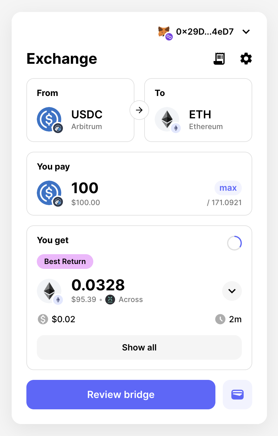
The wide variant allows you to take advantage of bigger page and screen sizes where you might have more available screen real estate. It provides a more comprehensive overview of available routes, displayed in a sidebar with slick animation.
```typescript theme={"system"}
const widgetConfig: WidgetConfig = {
variant: 'wide',
};
```
#### Chain Sidebar
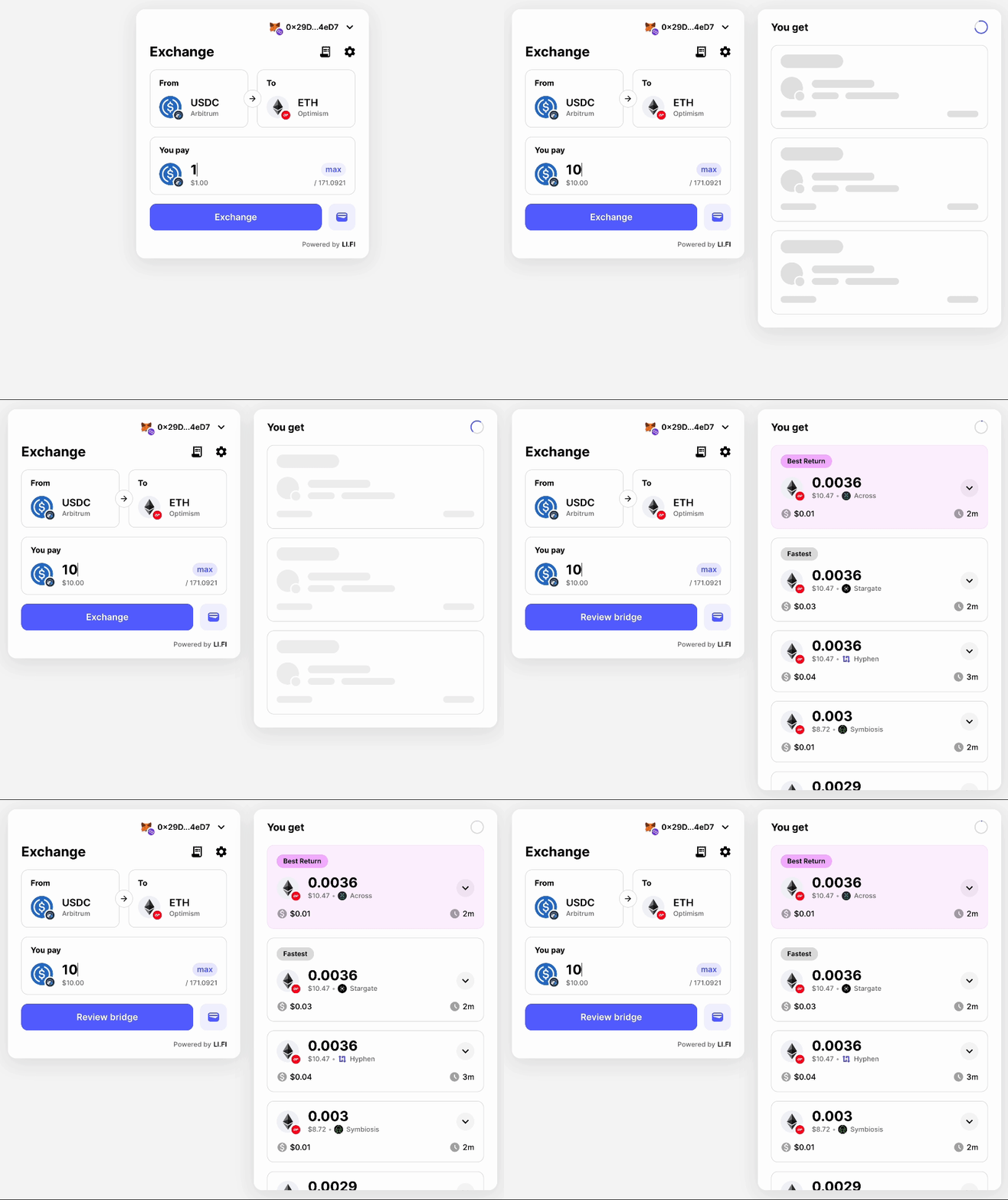
The `wide` variant shows a chain sidebar by default. To hide it, set `chainSidebar` to `true` in `hiddenUI`:
```typescript theme={"system"}
const widgetConfig: WidgetConfig = {
variant: 'wide',
hiddenUI: {
chainSidebar: true,
},
};
```
### Drawer Variant
The drawer variant allows you to show or hide the Widget based on user interaction. It can fit nicely on the page's side and has the same layout as the compact variant.
```typescript theme={"system"}
const widgetConfig: WidgetConfig = {
variant: 'drawer',
};
```
#### Controlling the Drawer
The drawer doesn't have a pre-built button to open and close it. To control the drawer, create and assign a `ref` to the widget:
```typescript theme={"system"}
import { useRef } from 'react';
import { LiFiWidget, WidgetDrawer, WidgetConfig } from '@lifi/widget';
export const WidgetPage = () => {
const drawerRef = useRef(null);
const toggleWidget = () => {
drawerRef.current?.toggleDrawer();
};
const openWidget = () => {
drawerRef.current?.openDrawer();
};
const closeWidget = () => {
drawerRef.current?.closeDrawer();
};
const isWidgetOpen = () => {
return drawerRef.current?.isOpen();
};
return (
);
};
```
#### WidgetDrawer Interface
```typescript theme={"system"}
interface WidgetDrawer {
isOpen(): boolean // Check if drawer is open
toggleDrawer(): void // Toggle drawer open/closed
openDrawer(): void // Open the drawer
closeDrawer(): void // Close the drawer
}
```
#### Controlled Drawer
You can also control the drawer state externally using the `open` and `onClose` props:
```typescript theme={"system"}
import { useState } from 'react';
import { LiFiWidget, WidgetConfig } from '@lifi/widget';
export const WidgetPage = () => {
const [isOpen, setIsOpen] = useState(false);
return (
);
};
```
***
## Height
Here are several recommended ways to configure the widget's height: **default, restricted max height, restricted height, and full height.**
Try different height configurations in the [Widget Playground](https://playground.li.fi/) — open **Height** in the sidebar.
We recommend default, restricted max height, or restricted height for the compact and wide variants. Full height is recommended only for compact. The drawer variant uses full container/viewport height.
### Default
By default the widget fits its content on smaller pages and caps at `686` pixels (`maxHeight`) on pages with long lists. This requires no config change.
### Restricted Max Height
The widget expands and contracts to fit content but won't exceed the stated max height. Overflow pages become scrollable.
Set `maxHeight` on `theme.container` as a number (pixels). Values above `686` (the default) are required.
```typescript theme={"system"}
import { WidgetConfig } from '@lifi/widget';
const widgetConfig: WidgetConfig = {
theme: {
container: {
maxHeight: 820,
},
},
};
```
### Restricted Height
All pages occupy the exact height specified — the widget stays a consistent size. Overflow pages become scrollable.
Set `height` on `theme.container` as a number (pixels). Values above `686` (the default) are required.
```typescript theme={"system"}
import { WidgetConfig } from '@lifi/widget';
const widgetConfig: WidgetConfig = {
theme: {
container: {
height: 900,
},
},
};
```
Don't use `height` and `maxHeight` together — they represent different layout approaches in the widget.
### Full Height
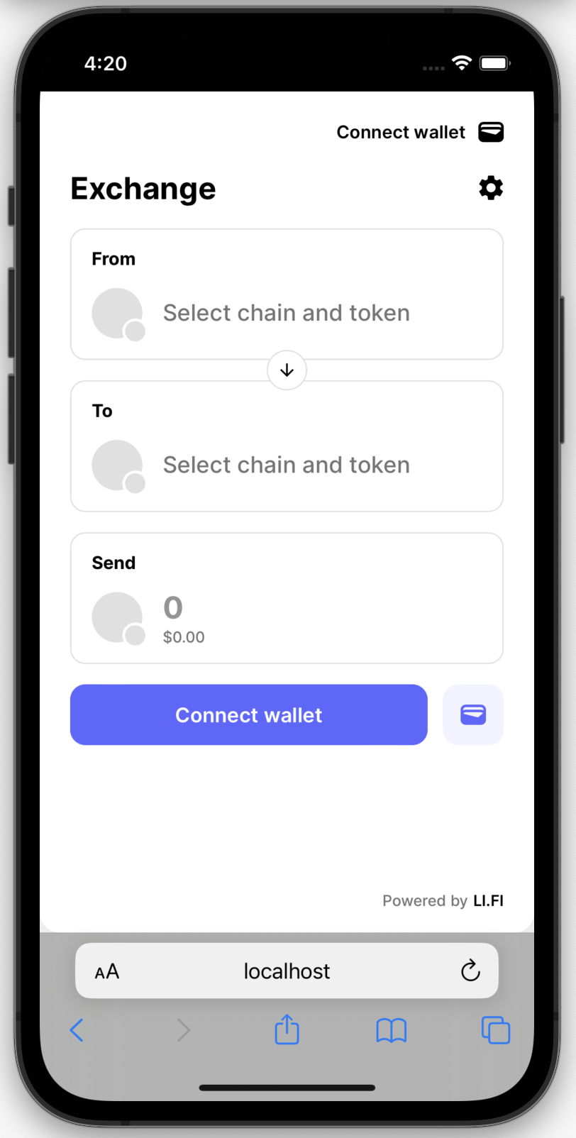
Recommended for mobile and limited screen space where the widget is the primary content. The widget fills the full height of its containing HTML element and delegates scrolling to the page.
```typescript theme={"system"}
import { WidgetConfig } from '@lifi/widget';
const widgetConfig: WidgetConfig = {
variant: 'compact',
theme: {
container: {
display: 'flex',
height: '100%',
},
header: {
position: 'fixed',
top: 0,
},
},
};
```
Configuration breakdown:
* **variant: 'compact'** — required; compact is built for smaller screens.
* **theme.container** — `display: 'flex'` and `height: '100%'` make the widget fill its container.
* **theme.header** (optional) — set `position: 'fixed'` and a `top` value to make the header sticky. Adjust `top` to account for elements above the widget (e.g. a 60px nav bar → `top: 60`). Without this, the header scrolls with page content.
Full height delegates sizing to the parent container, so your page's HTML and CSS must handle this correctly.
* Viewport meta may need to be updated for the page to present correctly
* e.g. ``
* The Widget Playground uses `min-height: 100dvh` — pages taller than the viewport remain scrollable, while shorter pages use flex to fill the screen.
* Add `overscroll-behavior: none;` to the root/body of your page to prevent undesired scrolling behavior.
Consider placement in relation to your site's navigation, headers, and footers. Preview header and/or footer placement in the [Widget Playground](https://playground.li.fi/) — open **Developer Controls** in the sidebar and toggle 'Show mock header' and/or 'Show mock footer'.
 ### Wide Variant
The wide variant allows you to take advantage of bigger page and screen sizes where you might have more available screen real estate. It provides a more comprehensive overview of available routes, displayed in a sidebar with slick animation.
```typescript theme={"system"}
const widgetConfig: WidgetConfig = {
variant: 'wide',
};
```
### Wide Variant
The wide variant allows you to take advantage of bigger page and screen sizes where you might have more available screen real estate. It provides a more comprehensive overview of available routes, displayed in a sidebar with slick animation.
```typescript theme={"system"}
const widgetConfig: WidgetConfig = {
variant: 'wide',
};
```
 #### Chain Sidebar
The `wide` variant shows a chain sidebar by default. To hide it, set `chainSidebar` to `true` in `hiddenUI`:
```typescript theme={"system"}
const widgetConfig: WidgetConfig = {
variant: 'wide',
hiddenUI: {
chainSidebar: true,
},
};
```
### Drawer Variant
The drawer variant allows you to show or hide the Widget based on user interaction. It can fit nicely on the page's side and has the same layout as the compact variant.
```typescript theme={"system"}
const widgetConfig: WidgetConfig = {
variant: 'drawer',
};
```
#### Chain Sidebar
The `wide` variant shows a chain sidebar by default. To hide it, set `chainSidebar` to `true` in `hiddenUI`:
```typescript theme={"system"}
const widgetConfig: WidgetConfig = {
variant: 'wide',
hiddenUI: {
chainSidebar: true,
},
};
```
### Drawer Variant
The drawer variant allows you to show or hide the Widget based on user interaction. It can fit nicely on the page's side and has the same layout as the compact variant.
```typescript theme={"system"}
const widgetConfig: WidgetConfig = {
variant: 'drawer',
};
```
 #### Controlling the Drawer
The drawer doesn't have a pre-built button to open and close it. To control the drawer, create and assign a `ref` to the widget:
```typescript theme={"system"}
import { useRef } from 'react';
import { LiFiWidget, WidgetDrawer, WidgetConfig } from '@lifi/widget';
export const WidgetPage = () => {
const drawerRef = useRef
#### Controlling the Drawer
The drawer doesn't have a pre-built button to open and close it. To control the drawer, create and assign a `ref` to the widget:
```typescript theme={"system"}
import { useRef } from 'react';
import { LiFiWidget, WidgetDrawer, WidgetConfig } from '@lifi/widget';
export const WidgetPage = () => {
const drawerRef = useRef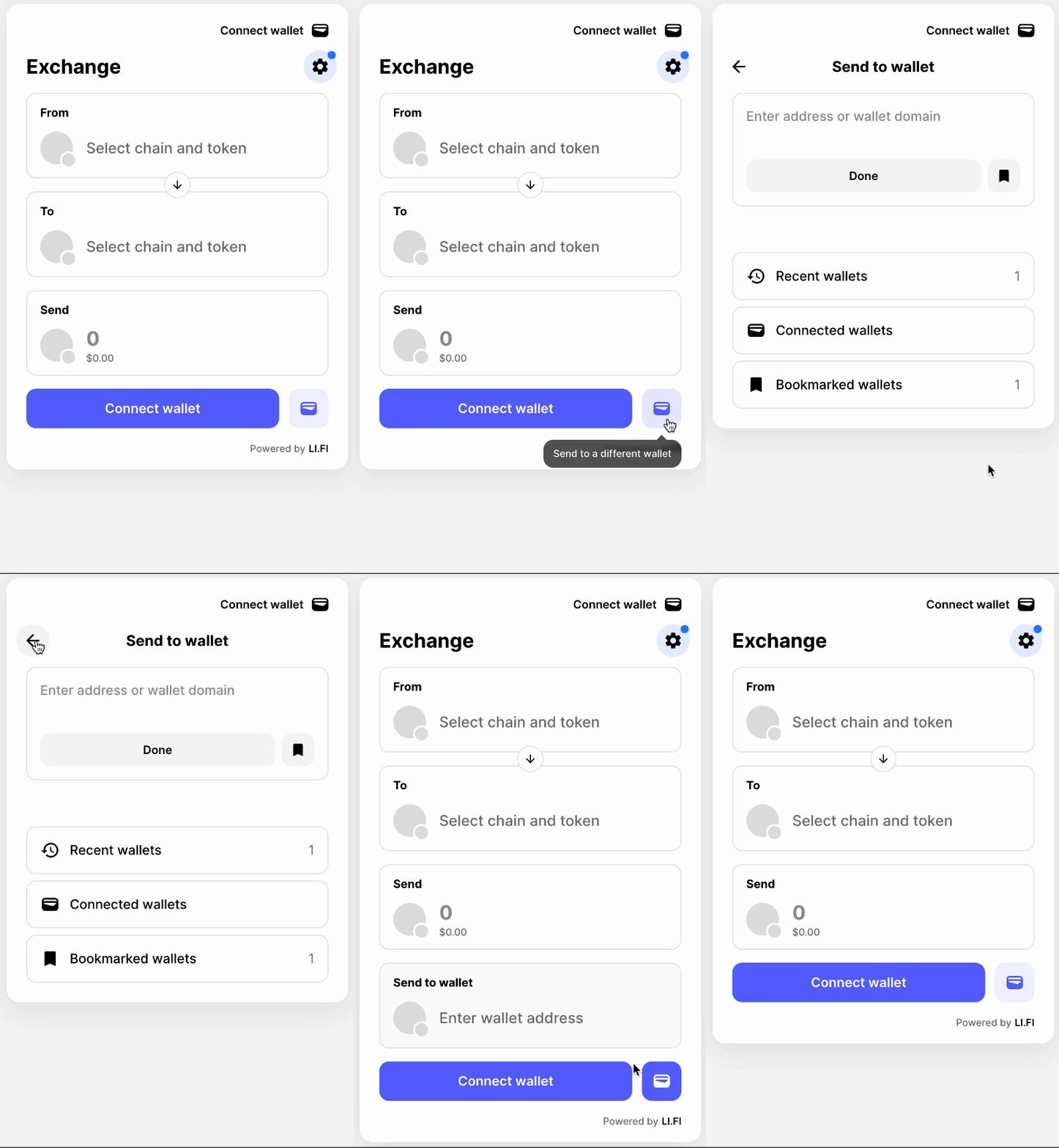 ### Restricted Height
All pages occupy the exact height specified — the widget stays a consistent size. Overflow pages become scrollable.
Set `height` on `theme.container` as a number (pixels). Values above `686` (the default) are required.
```typescript theme={"system"}
import { WidgetConfig } from '@lifi/widget';
const widgetConfig: WidgetConfig = {
theme: {
container: {
height: 900,
},
},
};
```
### Restricted Height
All pages occupy the exact height specified — the widget stays a consistent size. Overflow pages become scrollable.
Set `height` on `theme.container` as a number (pixels). Values above `686` (the default) are required.
```typescript theme={"system"}
import { WidgetConfig } from '@lifi/widget';
const widgetConfig: WidgetConfig = {
theme: {
container: {
height: 900,
},
},
};
```
 ```typescript theme={"system"}
import { WidgetConfig } from '@lifi/widget';
const widgetConfig: WidgetConfig = {
variant: 'compact',
theme: {
container: {
display: 'flex',
height: '100%',
},
header: {
position: 'fixed',
top: 0,
},
},
};
```
Configuration breakdown:
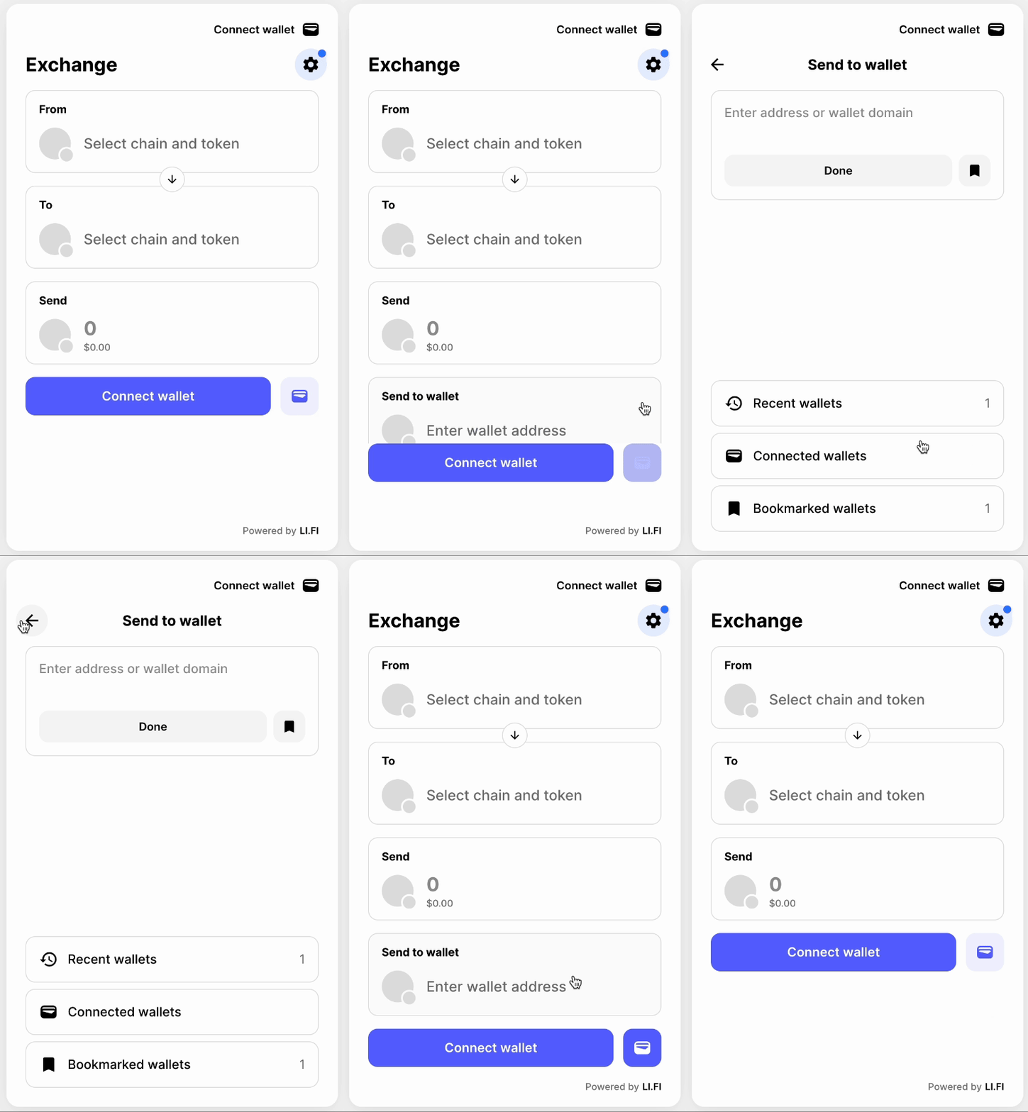
* **variant: 'compact'** — required; compact is built for smaller screens.
* **theme.container** — `display: 'flex'` and `height: '100%'` make the widget fill its container.
* **theme.header** (optional) — set `position: 'fixed'` and a `top` value to make the header sticky. Adjust `top` to account for elements above the widget (e.g. a 60px nav bar → `top: 60`). Without this, the header scrolls with page content.
Full height delegates sizing to the parent container, so your page's HTML and CSS must handle this correctly.
* Viewport meta may need to be updated for the page to present correctly
* e.g. ``
* The Widget Playground uses `min-height: 100dvh` — pages taller than the viewport remain scrollable, while shorter pages use flex to fill the screen.
* Add `overscroll-behavior: none;` to the root/body of your page to prevent undesired scrolling behavior.
```typescript theme={"system"}
import { WidgetConfig } from '@lifi/widget';
const widgetConfig: WidgetConfig = {
variant: 'compact',
theme: {
container: {
display: 'flex',
height: '100%',
},
header: {
position: 'fixed',
top: 0,
},
},
};
```
Configuration breakdown:
* **variant: 'compact'** — required; compact is built for smaller screens.
* **theme.container** — `display: 'flex'` and `height: '100%'` make the widget fill its container.
* **theme.header** (optional) — set `position: 'fixed'` and a `top` value to make the header sticky. Adjust `top` to account for elements above the widget (e.g. a 60px nav bar → `top: 60`). Without this, the header scrolls with page content.
Full height delegates sizing to the parent container, so your page's HTML and CSS must handle this correctly.
* Viewport meta may need to be updated for the page to present correctly
* e.g. ``
* The Widget Playground uses `min-height: 100dvh` — pages taller than the viewport remain scrollable, while shorter pages use flex to fill the screen.
* Add `overscroll-behavior: none;` to the root/body of your page to prevent undesired scrolling behavior.