Theme
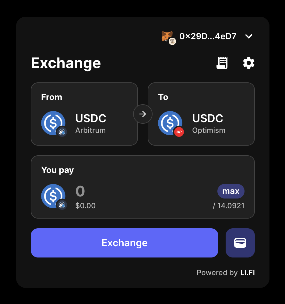
By customizing the theme, you can ensure the LI.FI Widget matches the look and feel of your application, providing a seamless user experience.Preview theme changes live in the Widget Playground — open Theme in the sidebar and click Edit theme.
theme configuration option allows you to customize various aspects of the widget’s appearance, including colors, typography, shapes, and component styles.
Containers
Thecontainer option customizes the main container of the widget.
The routesContainer and chainSidebarContainer options apply custom styles to routes and chain sidebar expansions respectively (available in wide variant).
In the example below, we adjust the boxShadow and border-radius properties of all the containers.

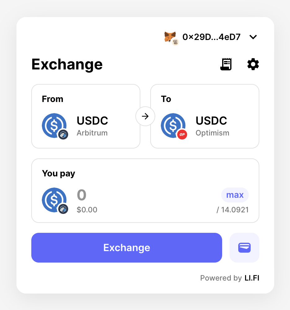
Before

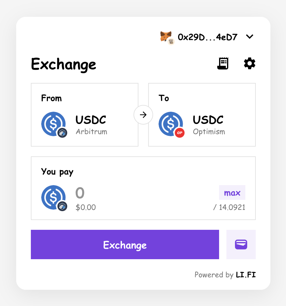
After
Color Schemes
ThecolorSchemes option defines separate color palettes for light and dark modes. This allows you to customize colors independently for each appearance mode.
Shape and Typography
Theshape option defines border-radius overrides for all elements in the widget:
borderRadius- Primary border radius for cards and containersborderRadiusSecondary- Secondary border radius for buttons and inputsborderRadiusTertiary- Tertiary border radius for specific elements
typography option customizes the font settings like font families.
Before
After
Components
Thecomponents option allows you to customize the styles of specific components within the widget.
The current list of available components:
- MuiAppBar - Used as a header/navigation component at the top of the widget.
- MuiAvatar - Used to display token/chain avatars.
- MuiButton - Used for various buttons in the widget.
- MuiCard - Used for card elements within the widget. There are three default card variants:
- outlined - Default variant where the card has thin borders.
- elevation - Variant where the card has a shadow.
- filled - Variant where the card is filled with color (
palette.background.paperproperty).
- MuiDrawer - Used for the drawer container when
variantis set to'drawer'. - MuiIconButton - Used for icon buttons within the widget.
- MuiInputCard - Used for input cards within the widget.
- MuiNavigationTabs - Used for navigation tabs in the split mode.
- MuiNavigationTab - Used for individual navigation tab items.
- MuiTabs - Used for tab navigation within the widget (available in
splitmode). - MuiCheckbox - Used for checkbox elements within the widget.
components option, each component can be customized using the MUI’s styleOverrides property, allowing for granular control over its styling.
Pre-configured Themes
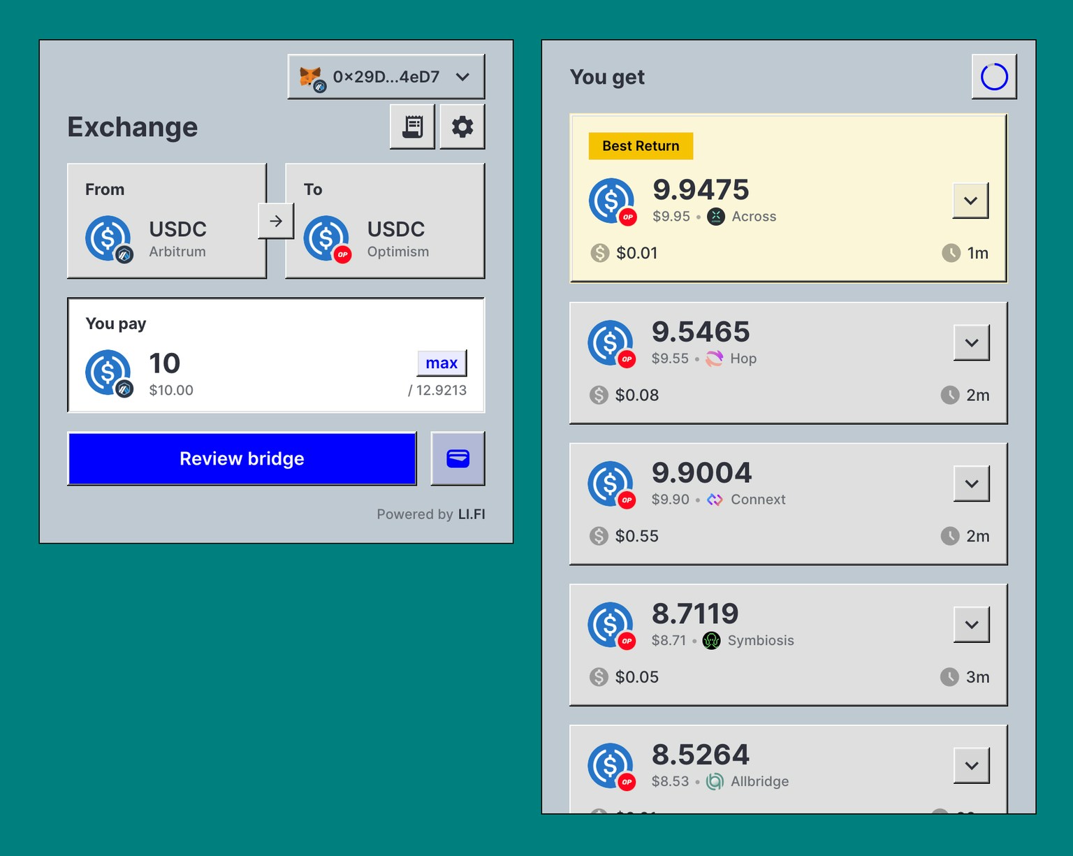
The LI.FI Widget includes several pre-configured themes that provide a starting point for customization. These themes demonstrate various configurations of colors, shapes, and component styles, giving you an idea of how the widget can be styled to fit different design requirements. Besides the default theme, there are pre-configured themes available:Azure Light
A clean, professional theme with blue primary colors.
Azure compact
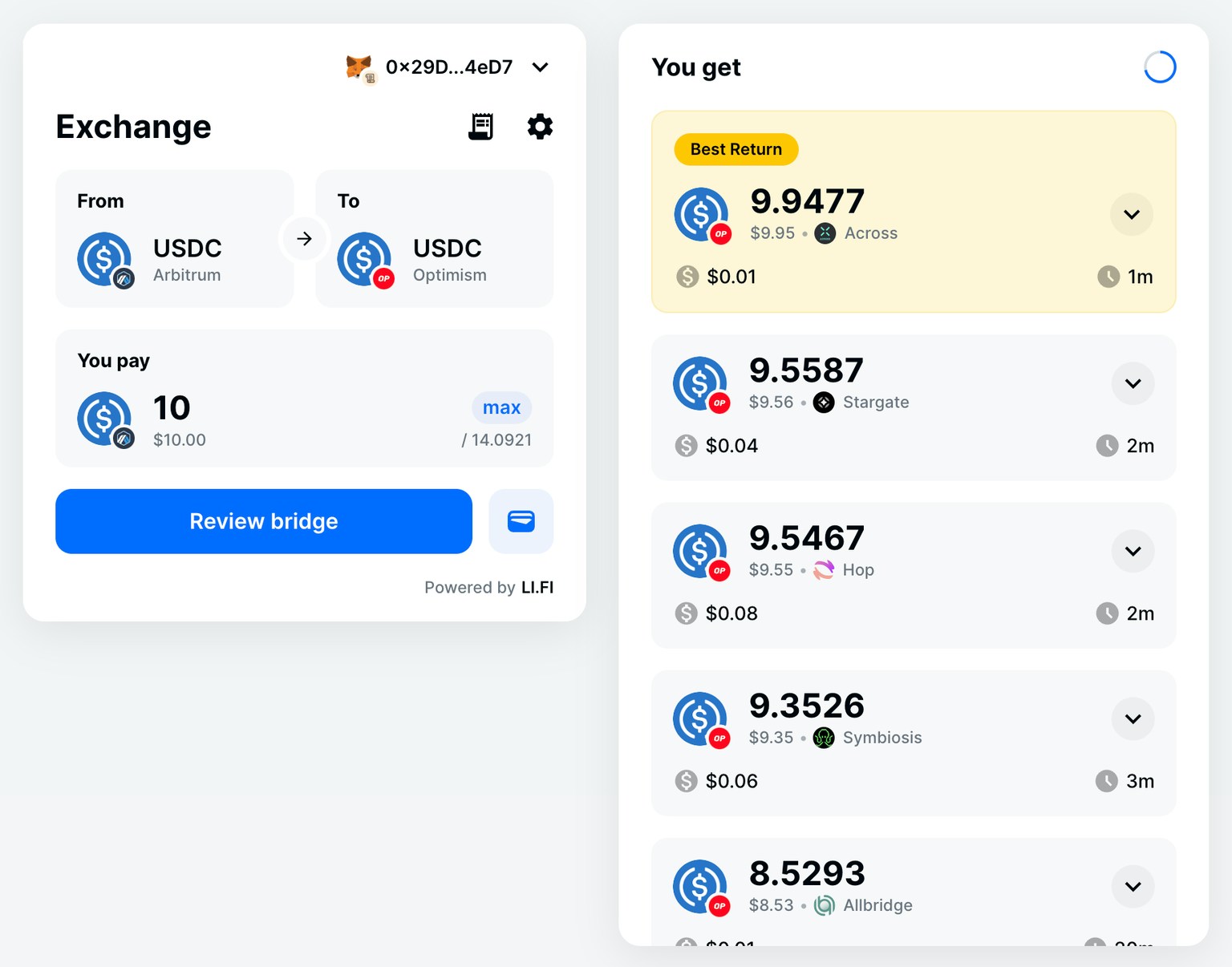
Azure wide
Watermelon Light
A playful theme with pink/coral primary colors.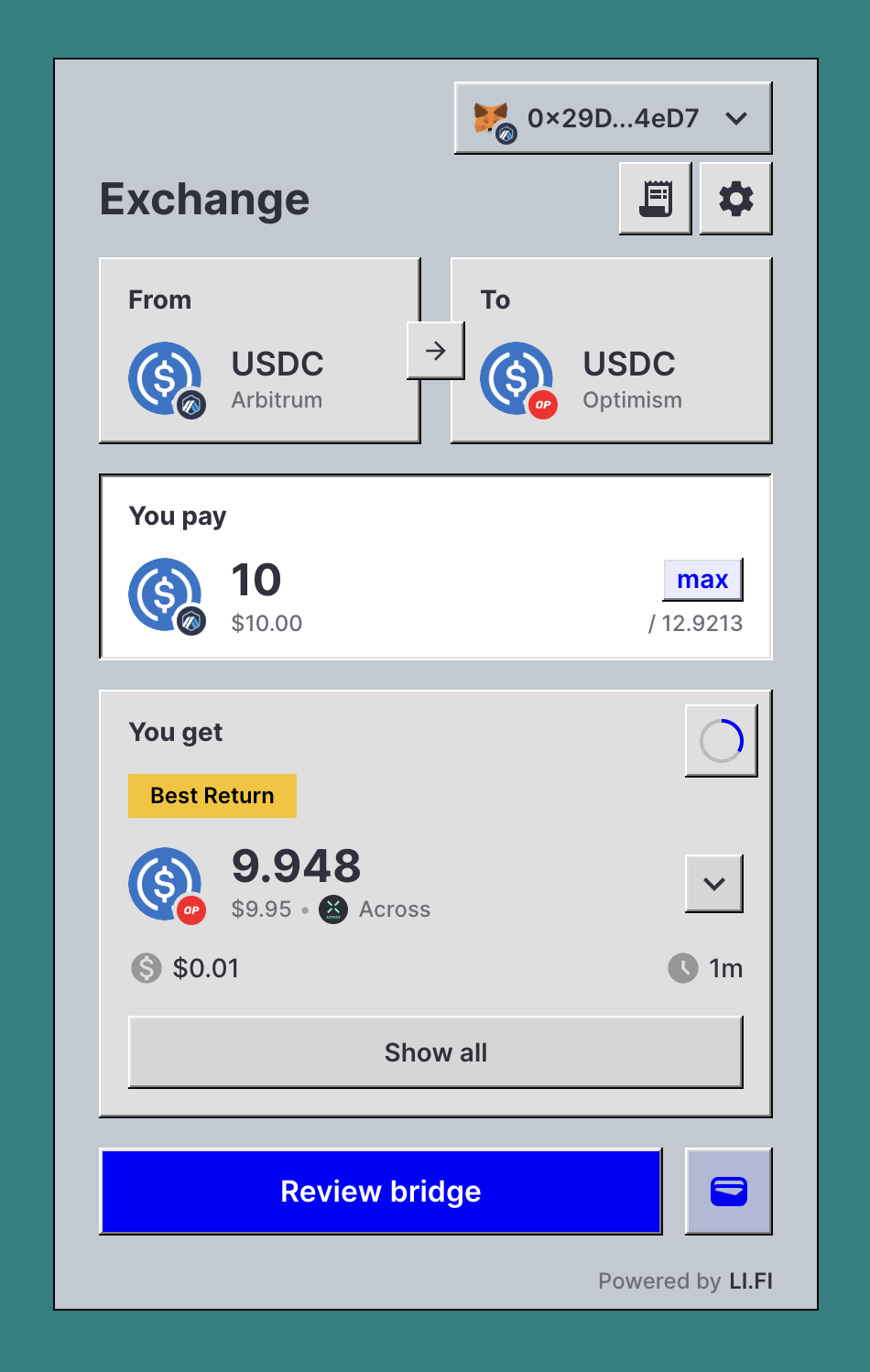
Watermelon compact
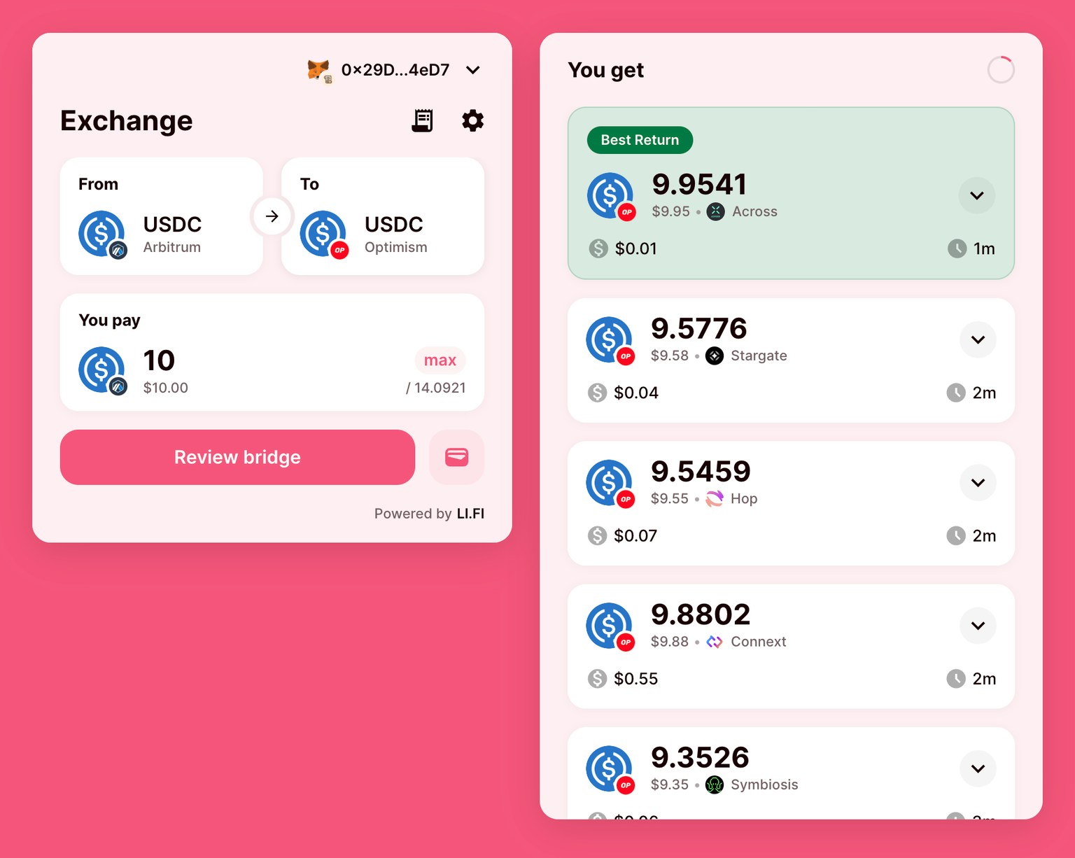
Watermelon wide
Windows 95
A retro theme mimicking the classic Windows 95 aesthetic with sharp corners and distinctive shadows.Windows 95 compact
Windows 95 wide
Customizing Pre-configured Themes
You can further customize these pre-configured themes by spreading them and overriding specific properties:Appearance
The widget has complete dark mode support out of the box. Theappearance option can be set to:
'light'- Always use light mode'dark'- Always use dark mode'system'- Match the user’s system settings (default)

Before
After
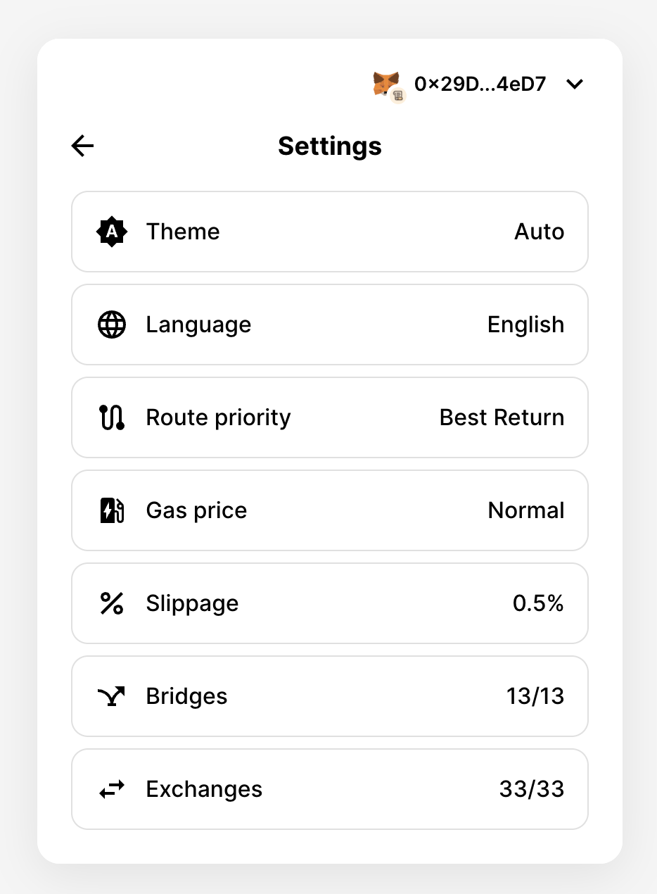
Disabled UI Elements
ThedisabledUI property allows you to specify which UI elements should be disabled in the widget. Disabling UI elements can be useful to prevent user interaction with certain parts of the widget that might not be necessary or desirable for your specific implementation.
Hidden UI Elements
ThehiddenUI property allows you to specify which UI elements should be hidden in the widget. This is useful for tailoring the user interface to fit your specific needs by removing elements that might not be relevant for your use case.
Before
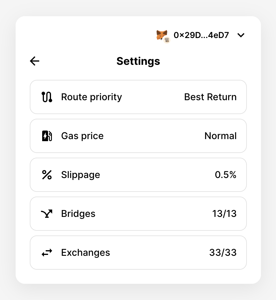
After
Required UI Elements
TherequiredUI property allows you to specify which UI elements should be required in the widget. This means that the user must interact with these elements for the widget to proceed with swapping/bridging.